Census data for person centered design

Mapping census data in R to show how we can use data to put people at the heart of decision making.
At the risk of being repetitive, in this blog post I’m going to be mapping social data for Scotland. This time, however, I’m going to use Scotland’s census data and the leaflet package.
Census data is a gold-mine of information, and I want to show how it can be used as a tool when looking at where we place provisions and facilities.
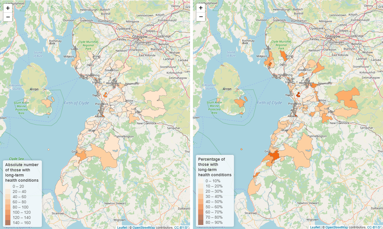
As an example, I’m going to map the number of people with one or more long-term health conditions in each output area (read: neighbourhoods) and overlay this with the location of 2021 polling stations.
The Electoral Commission states that everyone should be able to register and cast their vote without facing barriers. They should be able to vote on their own and in secret.
Scotland Census data
I have to be honest, I find the Scotland Census website an absolute maze and the process for accessing the data … non-trivial. But, I have cracked a method that works for me.
There is a table builder but you have to manually enter output area codes (with no copy and pasting), a massively time consuming task if you want data for the whole of Scotland or even a whole local authority.
Output areas are the lowest geographical level at which census estimates are provided. They have similar population sizes, approximately regular shapes, avoid mixing urban/rural postcodes, and are bound to a minimum size to retain confidentiality.
So instead, I downloaded all the .csv spreadsheets from the bulk data download! I know, not ideal given it’s 5.5 GB but if you want to look across a range of demographics and localities then this is the process I’d recommend. You do then have to do a bit of detective work to figure out what is in each sheet (a look-up table would be very handy!).
The Scotland Census table is easier to use at a local authority level, especially as it saves your previous selections - making multiple data downloads easier.
The flexible table builder for the 2022 census table looks a lot more user friendly so this process should be more streamlined when the next data set is released!
Scotland census data wrangling
-
Figure out what cut of the data you want to look at. In this blog I want to look at the breakdown of people with one or more long-term health conditions by output area.
-
Go to the Scotland Census website, search by topic and look for that breakdown. Under the title is an alpha-numeric code, this code relates to the name of the .csv file in the bulk data download.

- Having searched for and found the relevant .csv file, upload this into R - remembering to move the file into your R folder!
library(tidyverse)
library(sf)
library(rmapshaper)
library(leaflet)

Health <-
   read_csv("data/QS304SC.csv")
- Eventually we are going to merge this file with a shapefile for the output areas, I’m cheating a little with this step-by-step guide as we haven’t yet imported (or downloaded) the shapefile but spoiler alert we want to rename the column that contains the output area code.
Health <-
   Health %>%
   rename('code' = X1)
- What I want to do is look at the absolute number of people with one or more long-term health conditions, and how this translates as a percentage of the output area population.
Health_df1 <-
  Health %>%
  group_by(code) %>%
  mutate(abnum = `One or more conditions`,
        pct = round(abnum / `All people` *100, 1)) %>%
  select(code, abnum, pct)
- Now the data is wrangled we will need some geographical coordinates for the output areas to make a map. I downloaded the coastline clipped version of the output area shapefile from the National Records of Scotland.
OALayer <-
  st_read("data/OutputArea2011_MHW.shp",
          layer = "OutputArea2011_MHW")

OALayer <-
  st_transform(OALayer, "+init=epsg:4326")
- I also use
rmapshaperto simplify the shapefiles, just for quicker loading/rendering as the exact boundaries aren’t too important to me at this stage.
SimpleOA <-
  ms_simplify(OALayer)
- For this I am only going to look at the Ayrshires (North, South, and East) so rather than merge the entire shapefile and data, I filter the shapefile to the council codes of interest (I used this table to find the council codes). When the two files are merged it’ll only merge the output areas for the filtered councils.
AyrshireOA <-
    SimpleOA %>%
    filter(council == c('S12000008',
                    'S12000021',
                    'S12000028'))


Health_shp <-
  merge(AyrshireOA, Health_df1, by='code')
And that’s it! Nice and simple, right?
I know this probably seems like a lot of work and prep to get to this stage, but once you’ve put in the initial effort you will be set up to just switch out the census data.
And I promise it’ll all be worth the effort!
Mapping those with long-term health conditions
Before adding in the polling station data I think we’ve earned a map to look at - so first we’ll map the census data.
- We’ll need to define a palette -
bin <-
  colorBin('Oranges', domain = Health_shp$abnum)
- Then we can build the map! I’m calling up the data in
addPolygon()andaddLegend()because my intention is to later add further layers from different data sources.
There are much better resources out there for learning the in’s and out’s of the
leafletpackage, my intention is for you to be able to see the basics of this code being applied to this data set.
map <- leaflet() %>%
  addTiles() %>%
  addPolygons(data = Health_shp,
              color= "grey",
              weight = 0.75,
              smoothFactor = 0.5,
              opacity = 1.0,
              fillColor = ~ bin(abnum),
              fillOpacity = 1,
              popup = ~paste(abnum),
              highlightOptions =
              highlightOptions(color = "white",
                               weight = 1)
  ) %>%

  addLegend(data = Health_shp,
            "bottomright",
            pal = bin,
            values = ~ abnum,
            title = "Absolute number </br>
            of long-term illness </br> population",
            opacity = 0.6
  )

map
Polling Station data
Now we know where people with a long-term health condition live across Ayrshire, let’s see how this relates to polling stations from the 2021 Scottish Government election.
Disabled people are more likely to vote by post (35%) compared to non-disabled people (19%).
- The polling station data for Scotland is downloaded from the spatiial hub and imported into R.
PollLayer <-
  st_read("data/pub_polpl.shp", layer = "pub_polpl")

PollLayer <-
  st_transform(PollLayer, "+init=epsg:4326")
- Then the polling stations are filtered to only those in Ayrshire.
Ayrshire_Poll <-
  PollLayer %>%
  filter(local_auth %in%
           c('North Ayrshire',
             'South Ayrshire',
             'East Ayrshire'))
- And finally we can add these to our map.
map %>%
  addCircleMarkers(data = Ayrshire_Poll)
How do we use this?
We know that:
- Disabled people are less likely to use public transport;
- And those with long-term health conditions are more likely to make short public transport journeys only.
- People with a long-term health condition are also less likely to have access to a vehicle (46% no car/van compared to 19% of those with no illness).
Transport Scotland have an insightful summary on some of the barriers for disabled people using public transport
Of course, not all disabled people encounter barriers to travelling; however, in areas with high numbers of people with long-term illness and no nearby polling station:
- what is the voting rate of the general output area population?
- what is the voting rate of those with long-term health conditions?
And then across Ayrshire -
- do areas with high absolute and relative numbers of people with long-term health conditions that also have polling stations, have higher voting rates?
If voting rates are comparably lower amongst those with long-term health conditions and no local polling stations, could this indicate the locations of the polling stations aren’t accessible to all?
In 2017, those with limiting health conditions were less likely to confidently report they would vote in the upcoming UK General Election.
I should also state two other things:
-
I have no idea how the decision to locate polling stations is actually made, I imagine population figures and availability of suitable buildings plays a large role. I’m using this data as an example only!
-
Just because a polling station is physically located in an accessible place, it doesn’t mean that the building nor the voting process itself is accessible
Polling stations can be replaced with any building, facility, or provision that is of interest, and the underlying census data can be a range of different demographics.
This post is intended to provide a guide on how census can be an insightful tool when we want to build opportunities that intend to serve communities; by taking that first step and asking where and how? Where are the people we want to engage? And how do we reduce/remove any barriers to ensure equitable access to our service?
Summary image by frank mckenna on Unsplash