Forecasting displacement

Understanding the global refugee and internal displacement crisis, and how this is likely to evolve over time. Spoiler, it’s not looking good.
Introduction
I really enjoy taking part in the R4DS #tidytuesday, however, since having my daughter a year ago I’ve struggled to find the time (and energy) to get involved.
Side note, I also feel like I lost the community move with all the recent changes to
This meant I was already a few weeks behind when I saw that one of the most recent datasets was using the UNHCR {refugees} package. International Development and R definitely overlap on my Venn diagram, so I naturally wanted to try and find a way to use this package.
The topic of refugees, particularly the number seeking asylum in a new country, is fraught with politics. The narrative around the safe haven of refugees in the UK media quite often forgets to mention that someone who has become forcibly displaced from their home is quite often one of the most vulnerable people on the planet.
That’s not to say that people don’t have genuine concerns about their countries rising populations, especially around the impact of sudden population growth on local services and provisions.
From a UK media perspective, it can feel like the number of refugees ebbs and flows in response to specific one-off events, such as the invasion of Ukraine. But how accurate is this? And can we make any predictions on what global refugee figures are likely to do in future?
I thought this package would be a good opportunity for some light-touch forecasting in R, allowing for some insight on past, current, and future trends.
Forecast modelling in R
Prerequisites
To follow along with this first part of the code very little R knowledge is required. I’m using RStudio and a handful of packages.
You can view all the code provided below on my GitHub.
I usually skip over the installation of packages step (I do a lot of loading of {tidyverse}, which I know makes base R purists cringe!). However, if these packages are new to you then it might be easiest to do a mass install.
# Install required packages
install.packages(c("refugees", "dplyr", "forecast", "ggplot2", "stringr", "showtext", "readr"))
Loading the libraries & preparing data
The first thing I do is load all packages at the top of a project, if you start adding in libraries further down in your code it’s sure to lead to chaos!
# Load required libraries
library(refugees) # population data https://github.com/PopulationStatistics/refugees
library(dplyr) # manipulating the data
library(forecast) # to forecast refugee numbers
library(ggplot2) # plotting the data
library(stringr) # wrapping text labels
library(showtext) # using custom fonts
library(readr) # reading in csv files
Then I load my custom fonts that I’ll later use for my ggplots - again so I can easily find these when coming back to the project. I tend to use Google Fonts as it has a wide variety of free fonts.
# Custom font loading
font_add_google('Patrick Hand', 'labels')
font_add_google('Lato', 'lato')
showtext_auto()
I started with the population dataset from the {refugees} package, however, I also wanted to compare refugee figures to that of the global population (world_pop).
I took the global population figures from the WorldBank DataBank, however, you could also use the
pop_estfigures from the{rnaturalearth}package (used further on).
world_pop <- read_csv("data/world_pop_data.csv")
Here I am forecasting global refugee figures but I also wanted the option to explore individual countries data as well. So in the name of efficiency I kept the one dataframe (that also demonstrates a nice and simple if/else statement in R). I added the option to filter to an individual country (based on the coo column in the dataset). I’ve not added country breakdowns to this blog as I felt like the strength in the forecasting was the aggregated global data and that numbers would be too nuanced at a country level.
As I’m interested in the number of refugees per year, I group by year and sum the number of refugees.
# Change this to the desired country code (coo_iso)
# or 'none' to include all data
country_filter <- 'none'

if (country_filter == 'none') {
  filtered_data <- population %>%
    group_by(year) %>%
    summarise(total_refugees = sum(refugees))
} else {
  filtered_data <- population %>%
    filter(coo_iso != country_filter) %>%
    group_by(year) %>%
    summarise(total_refugees = sum(refugees))
}
If you didn’t want to use the country_filter you could just simply write:
  filtered_data <- population %>%
    group_by(year) %>%
    summarise(total_refugees = sum(refugees))
Forecasting refugee numbers
Forecasting requires time series data, so the next step is to convert my data to a time series object.
refugee_time_series <-
  ts(filtered_data$total_refugees,
     start = 1951,
     frequency = 1)
Using the auto.arima function of the {forecast} package takes a lot of the hard work out for me. auto.arima analyses my time series data, considers the ARIMA model parameters of my data, then selects the most appropriate model.
If you want to know more about forecasting I recommend some other sources
The selected model is then used to forecast refugee figures for a period of time (here 8 years).
arima_model <- auto.arima(refugee_time_series)

# Forecast future refugee numbers (e.g., for the next 8 years)
forecast_values <- forecast(arima_model, h = 8)
I then converted my forecasted values into a dataframe as I’m going to combine these with other dataframes for my ggplot.
forecast_df <- data.frame(
  year = seq(2022, 2029),
  forecasted_total_refugees = forecast_values$mean,
  lower_CI = forecast_values$lower,
  upper_CI = forecast_values$upper
)
Forecasting internally displaced people numbers
I repeated the above steps for the idmc dataset in the {refugees} package. This dataset provides the number of internally displaced people from each country, over time. The script used for this is also on my GitHub page.
# idp data
filtered_idp_data <- idmc %>%
  group_by(year) %>%
  summarise(total_idp = sum(total))

# Convert 'Year' column to a time series object
idp_time_series <-
  ts(filtered_idp_data$total_idp,
     start = 1989,
     frequency = 1)

# Choose an appropriate ARIMA model using auto.arima
arima_idp_model <- auto.arima(idp_time_series)

# Forecast future refugee numbers (e.g., for the next 7 years)
forecast_idp_values <- forecast(arima_idp_model, h = 8)

# Create a data frame for forecasted values
forecast_idp_df <- data.frame(
  year = seq(2022, 2029),
  forecasted_idp = forecast_idp_values$mean,
  lower_CI = forecast_idp_values$lower,
  upper_CI = forecast_idp_values$upper
)
Plotting the data
I’ve included all the code I used to create the figure above in the R Script accompanying this blog post. I’m not including it here because a) it’s so long almost certainly everyone would stop scrolling at this point and b) there is a lot of individual faff finesse to ggplots and the point of this post isn’t to share them all.
Breaking down refugee destinations
I also wanted to breakdown the destinations of refugees, again from the population dataset from the {refugees} package. I was specifically interested in the global and financial distribution of countries that provide haven for refugees.
This required a slightly different set of packages.
# Packages for visualization
library(ggstream)

# Packages for spatial data
library(sf)
library(rnaturalearth)
library(refugees)
I used the {rnaturalearth} package and selected key details about a country, including its economic and income status.
filtered_world <-
  world %>% select(pop_est, economy,
                   income_grp, iso_a3,
                   continent, subregion)
Using the iso_a3 country codes, I was able to merge my filtered world data with the {refugee} population data. It’s worth nothing that the conflicts in population meant I had to use refugee::population for this section to ensure R knew which package and dataset I specifically wanted.
# Function to merge data
merge_data <- function(data, world_data, by_column) {
  merge(data, world_data, by.x = by_column, by.y = 'iso_a3')
}

# Merge refugee data with world data
merged_refugee_data <- merge_data(refugees::population, filtered_world, 'coa_iso')
Then I again grouped by year and the column of interest; economy, income_grp, or continent.
economy_df <- merged_refugee_data %>%
  group_by(year, economy) %>%
  summarise(total_refugees = sum(refugees)) %>%
  mutate(label = "economy")
The code I used for plotting with {ggstream} is also on my GitHub.
Thanks to Cedric Scherer for sharing his {ggstream} code over on r-graph-gallery, which was inspiration for the streamgraphs.
Understanding the data
How have global refugee figures changed over time?
The number of refugees has increased from 2 million in 1951 to 29 million in 2022. With the exception of a peak of ~ 3 million in the mid-1960’s, global refugee figures remained fairly consistent until the 1970’s. By the end of the 1970’s, the number of refugees had risen from 2.5 million in 1970 to 6.3 million in 1979. There were 17 million global refugees by 1990.
The early 2000s witnessed a relative drop in global refugee numbers compared to the previous decade, dipping to a low of 8.6 million in 2005. Figures had reached 10.5 million by 2010 and by 2017 surpassed the previous all time record figure, hitting 19 million.
In 1960, global refugees comprised 0.05% of the world’s population, but by 2022, this percentage had risen to 0.4%.
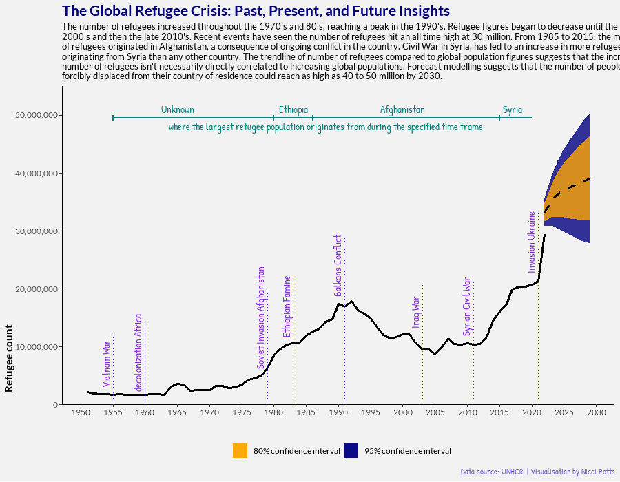
Although, the increase in global refugees has increased over time - this increase has not been linear. The fluctuations in global refugee figures are, unsurprisingly, closely tied to regional conflicts. For example, the 1990s brought about a notable increase due to conflicts in the Balkans, Africa, and the Middle East, resulting in a peak of global refugee populations.
The decline of the early 2000’s can attributed to a complex web of factors, including the end of certain protracted conflicts, improved diplomatic efforts, and repatriation initiatives, as well as, stricter border controls and asylum policies in some Western countries. Even though there was a decline, it’s worth noting that the number of refugees during this period was still approximately 4 million higher than in the 1970s.
The number of global refugees has continued to rise since the onset of the Syrian Civil War in 2011.
Forecasting indicates that by 2029, the number of individuals forced to become refugees could reach as high as 39 million, with upper estimates reaching 50 million. This would account for approximately 0.5% to 0.6% of the global population.
Internally displaced people
Unlike refugees who cross international borders, internally displaced people (IDPs) remain within their own country’s borders, making figures more challenging to accurately track. The data we have shows that the number of people internally displaced fluctuated around the 20 to 24 million figure from the 1990’s to 2011. By 2013, the number of IDPs hits 33 million, quickly rising to 40 million in 2015. IDP figures double from the 1990’s figures by 2020, reaching 48 million and continue to rise to 60 million by 2022.
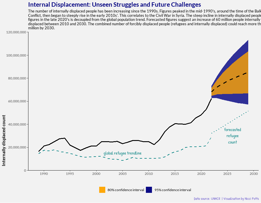
Although the increase in IDPs has been more recent, figures have been consistently higher that that of global refugees. This isn’t surprising when you consider the barriers to fleeing across international borders, including legal, logistical, and security issues. Not to mention a reluctance for people to leave their home country if they can find refuge elsewhere within their nation. However, iIDPs often face similar challenges as refugees, such as loss of livelihoods, shelter, and access to basic services, but they may receive less international attention and assistance, which can lead to protracted displacement.
Forecasting indicates 85 million people could be internally displaced by 2029, 1% of the global population. At the upper confidence interval, figures could reach over 100 million IDP - 1.3% of the global population.
Total displacement
By 2022, 92 million people were displaced (internally and refugees), which is 1.1% of the global population. This is a considerable increase from 31 million in 1989 (0.6% of global population). Both IDP and refugee figures experienced sharp increases in the 2010’s. A shocking testament to the devastating impact of the Syrian Civil War.
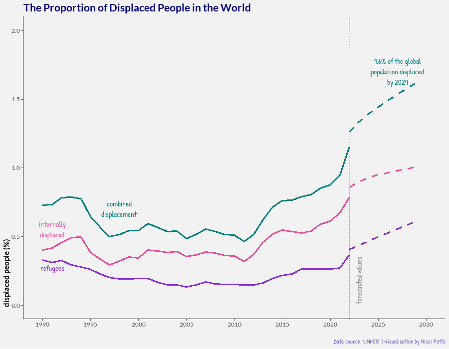
Forecasting suggests the total number of displaced people could reach 137 million people by 2029, 1.6% of the global population.
I think I can assume anyone reading this agrees that it is crucial for countries to show compassion by providing refugee to those in need. However, that isn’t to say that opening up borders to refugees doesn’t present logistical, social, and economic challenges. A grim reality is that the number of displaced people is likely to raise over the next decade. Increasing the need for effective policies that support internally, and globally displaced people, through compassionate and pragmatic interventions.
Where do refugees flee to?
As a final point, I wanted to look at the countries of asylum for refugees as, again, UK media would have us believe that all refugees head straight to Calais. I’ve grouped countries into their continents, getting into the granularity of individual countries felt like I’d be venturing into territory that wouldn’t be appropriate for me as a Civil Servant to comment on.
Over time, we can see that the continents that have provided asylum for refugees has changed dramatically. And while most continents have increased the number of refugees they take in, proportionally Africa and Asia have seen large increases compared to Europe.
The country of refugee will undoubtedly be related to a few key points, such as: proximity, existing communities, as well as, perceived safety and support systems. Proximity being key, giving the logistics of fleeing a country and crossing international borders.
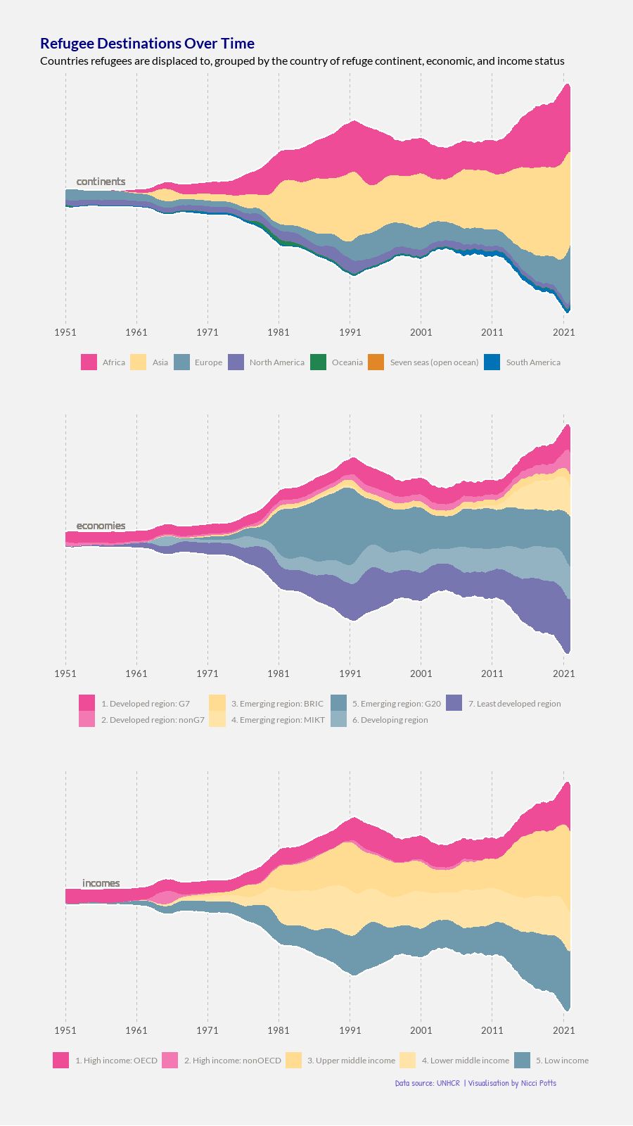
If we look at the economies of those countries accepting refugees, we again see a changing landscape. Developed nations have taken a steady number of refugees over time, but proportionally this has become fewer and fewer of the global refugees needing asylum. The emerging, developing, and least developing nations have been increasing their proportional intake of refugees over time.
Again, proximity will play an important role in which economic regions do take in refugees - however, it’s worth noting that as developing and least developed countries increase their populations through hosting refugees there is a role for other regions to take in supporting these countries.
Finally looking at the incomes of countries hosting refugees, there is an unsurprising similarity to the trends observed in the economic region breakdown. The key take sways being that since the 1980’s, middle and low income countries have proportionally hosted more refugees than high income countries.
Final thoughts
As with most things I blog about, I wanted to try and show how some light touch coding can give us data visualizations to be used as conversation starters. Personally, I was surprised on the distribution of countries hosting refugees and the sharp increases in displacement seen after the Syrian Civil War.
Looking forward to the 2030’s could prove a grim reality, especially when we consider the increasing impacts of climate change on displacement. At a time when many are feeling the effects of a cost of living crisis, it’s easy to think that we must direct resources internally. However, if we are to reduce the number of people displaced, and subsequently seeking shelter elsewhere, then we must be proactive.
Summary image by Knrick Mills from Unsplash